Branding
Madrigal Studios
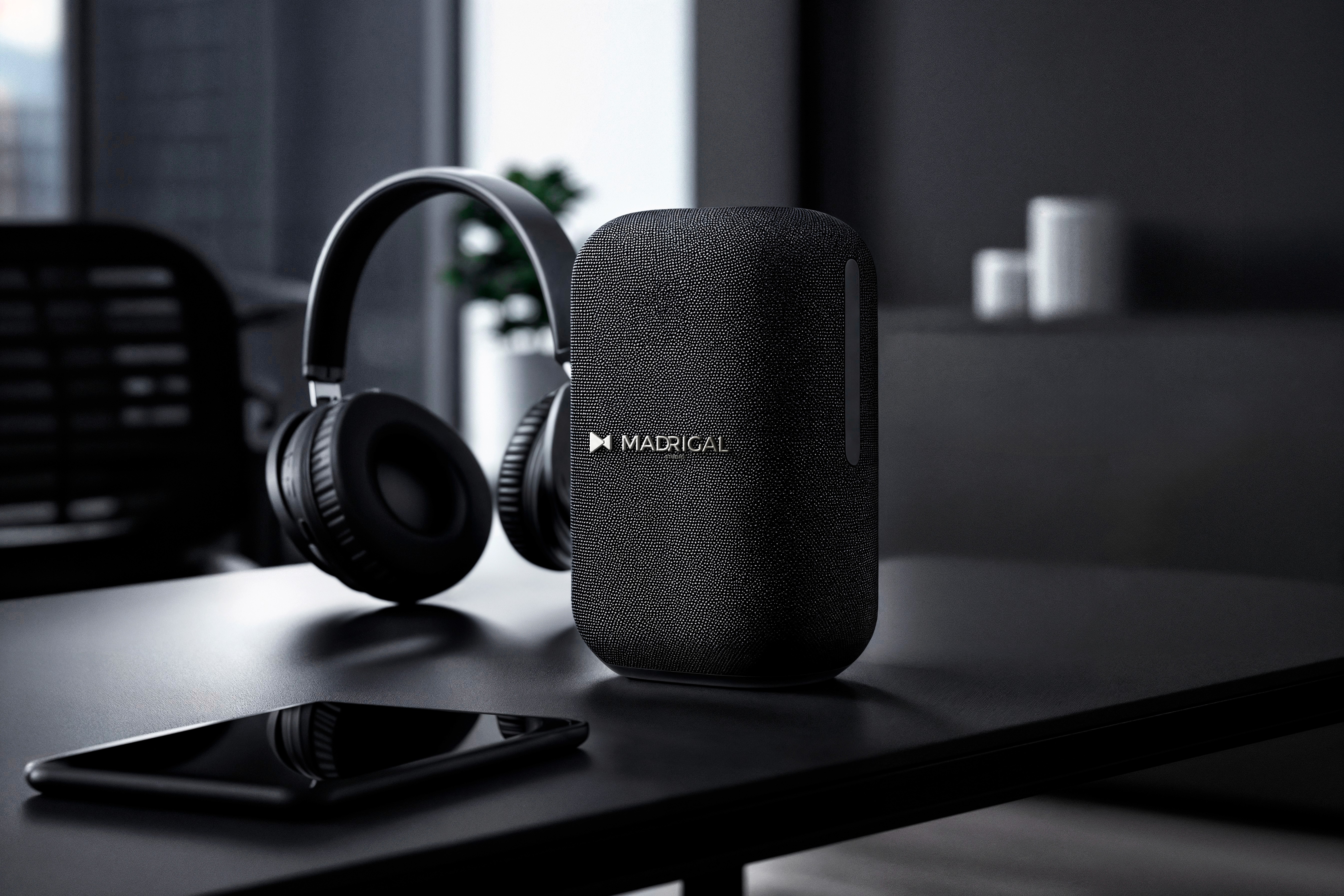
A thoughtfully crafted visual identity for Madrigal Studio, balancing expressive creativity with understated sophistication through a distinctive typographic system and a refined, adaptable mark.
Year :
2026
Industry :
Music Industry
Client :
Madrigal Studios
Project Duration :
3 weeks

Briefing :
Client wanted to create a logo for Madrigal Studio that felt true to our creative personality. The identity needed to have a refined aesthetic while still feeling expressive and memorable.
Since the logo would be used across their digital presence, branding, & creative applications, they were looking for something versatile & timeless, rather than something that followed a passing design trend. The overall direction was to keep it simple, but with enough character to make Madrigal Studio instantly recognisable.

Solution :
I approached the identity by keeping the design simple, refined, and concept-led. Instead of adding unnecessary visual elements, I focused on creating a strong typographic foundation and introducing a subtle monogram that gave the logo its own personality.
The design was developed to feel balanced and versatile, allowing the identity to work seamlessly across digital platforms, print, social media, and other brand applications. The result is a clean yet distinctive logo that reflects Madrigal Studio’s creative character while maintaining a timeless visual presence.

Challenge :
Creating a logo that felt creative and distinctive without becoming overly complex, while ensuring it remained minimal, versatile, and memorable across different brand applications.

More Projects


Branding
Madrigal Studios
A thoughtfully crafted visual identity for Madrigal Studio, balancing expressive creativity with understated sophistication through a distinctive typographic system and a refined, adaptable mark.
Year :
2026
Industry :
Music Industry
Client :
Madrigal Studios
Project Duration :
3 weeks
Briefing :
Client wanted to create a logo for Madrigal Studio that felt true to our creative personality. The identity needed to have a refined aesthetic while still feeling expressive and memorable.
Since the logo would be used across their digital presence, branding, & creative applications, they were looking for something versatile & timeless, rather than something that followed a passing design trend. The overall direction was to keep it simple, but with enough character to make Madrigal Studio instantly recognisable.
Solution :
I approached the identity by keeping the design simple, refined, and concept-led. Instead of adding unnecessary visual elements, I focused on creating a strong typographic foundation and introducing a subtle monogram that gave the logo its own personality.
The design was developed to feel balanced and versatile, allowing the identity to work seamlessly across digital platforms, print, social media, and other brand applications. The result is a clean yet distinctive logo that reflects Madrigal Studio’s creative character while maintaining a timeless visual presence.
Challenge :
Creating a logo that felt creative and distinctive without becoming overly complex, while ensuring it remained minimal, versatile, and memorable across different brand applications.
More Projects
Branding
Madrigal Studios
A thoughtfully crafted visual identity for Madrigal Studio, balancing expressive creativity with understated sophistication through a distinctive typographic system and a refined, adaptable mark.
Year :
2026
Industry :
Music Industry
Client :
Madrigal Studios
Project Duration :
3 weeks
Briefing :
Client wanted to create a logo for Madrigal Studio that felt true to our creative personality. The identity needed to have a refined aesthetic while still feeling expressive and memorable.
Since the logo would be used across their digital presence, branding, & creative applications, they were looking for something versatile & timeless, rather than something that followed a passing design trend. The overall direction was to keep it simple, but with enough character to make Madrigal Studio instantly recognisable.
Solution :
I approached the identity by keeping the design simple, refined, and concept-led. Instead of adding unnecessary visual elements, I focused on creating a strong typographic foundation and introducing a subtle monogram that gave the logo its own personality.
The design was developed to feel balanced and versatile, allowing the identity to work seamlessly across digital platforms, print, social media, and other brand applications. The result is a clean yet distinctive logo that reflects Madrigal Studio’s creative character while maintaining a timeless visual presence.
Challenge :
Creating a logo that felt creative and distinctive without becoming overly complex, while ensuring it remained minimal, versatile, and memorable across different brand applications.